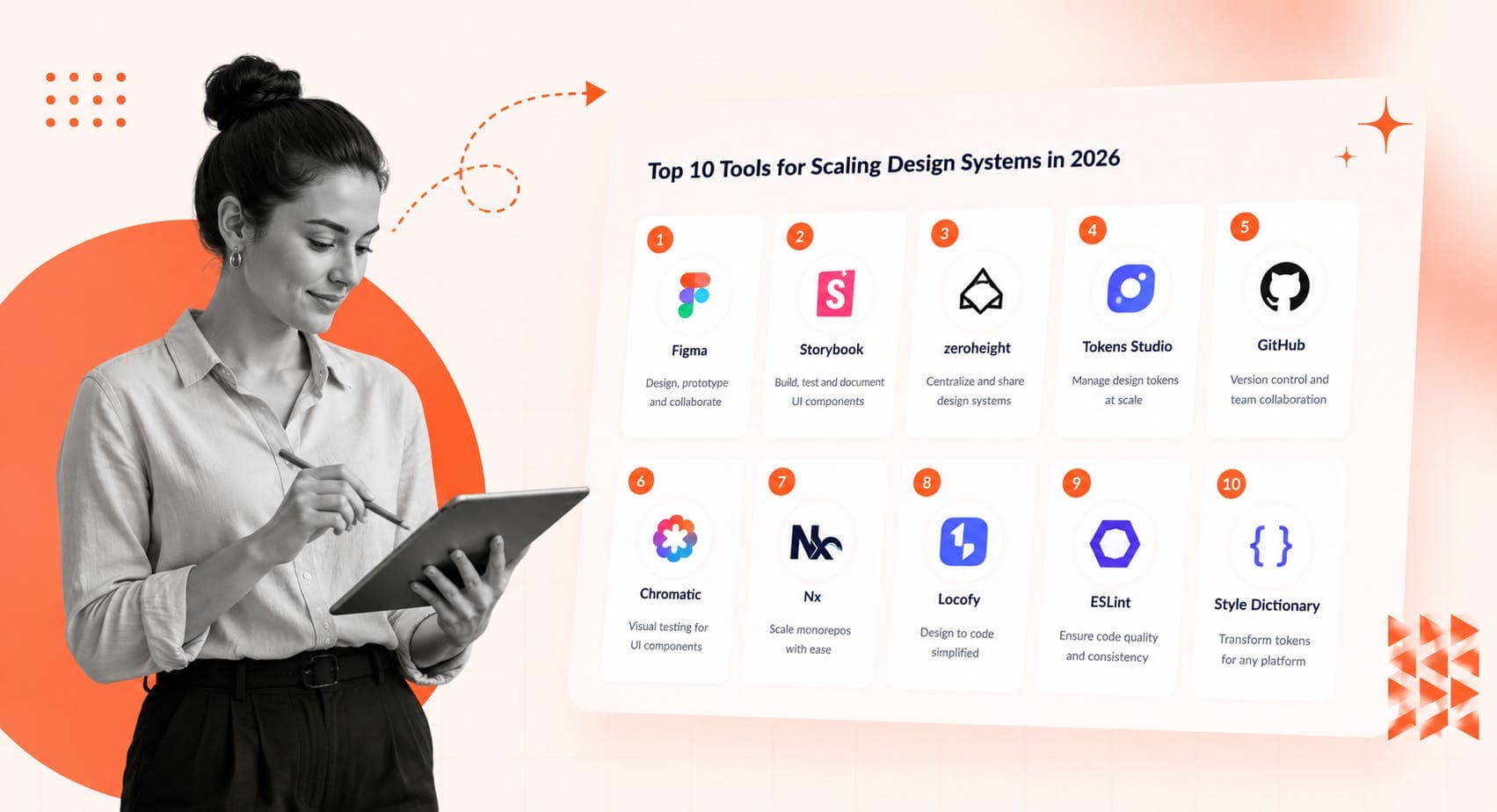
Organizations that treat design systems as long-term infrastructure - not just design assets - invest earlier in governance, tooling, and automation. That shift in thinking is what separates teams with thriving, scalable design system services from teams rebuilding the same components every year.
This guide skips the generic "best tools" list format. Instead, it explains why each tool matters, where it fits in the stack, and who it is actually for - matched to system maturity so you buy what you need, not what looks impressive in a vendor demo.
How to Use This Guide
Each tool below is labeled with its category and the maturity stage where it adds real value. At the end, there's a stack table you can use directly to match tools to your current situation.
Category: Design and Component Creation
Best for: All maturity levels
Figma's near-total adoption in the design system space is not marketing - it reflects how thoroughly it has become the foundation of how product teams work. The 2026 Design Systems Report puts Figma's adoption rate above 95% in design tooling, making it the closest thing to a universal standard the industry has.
At enterprise scale, Figma is considerably more than a collaborative canvas. Shared libraries enable component management across teams. Variables and modes support theming and brand variants. Real-time collaboration cuts alignment overhead for distributed organizations. AI-assisted workflows continue to evolve toward faster iteration while maintaining consistency.
The important caveat: Figma does not provide deep governance, approval workflows, or production code parity on its own. That makes it essential - but incomplete - for teams building at scale. What Figma starts, the rest of this stack finishes.
Category: Engineering Integration
Best for: Growth-stage through enterprise
Storybook is the engineering backbone of most serious design systems. It provides a live environment for documenting production-ready components in code - each "story" shows a component state, its props, and how it behaves in isolation.
The value is in what it prevents. When engineers can browse and test the real component library before building, they stop reimplementing. Storybook was built by developers for developers - if your design system is primarily a code system, a React component library that designers adapt their work to, Storybook is the right home for it.
Storybook is also free and open-source, which makes it the default starting point for engineering-led documentation. It works with React, Vue, Angular, Svelte, and more, and has a large ecosystem of community add-ons. The trade-off: it's not designer-friendly. Product managers and non-technical stakeholders need a separate layer to navigate it comfortably.
Category: Documentation
Best for: Growth-stage through enterprise, regulated environments
Zeroheight solves the problem Storybook deliberately ignores: cross-functional documentation that designers, product managers, and developers can all navigate without touching a terminal.
Among purpose-built documentation tools, Zeroheight users report a 79% satisfaction rate - the highest of any documentation tool in the 2026 Design Systems Report. It connects Figma files, embeds Storybook stories, and hosts usage guidelines and governance documentation in one place.
The common pattern for mature teams: use Zeroheight for complete documentation alongside Storybook for developer-facing component documentation - both have a role; they're not substitutes. Teams fighting documentation sprawl - multiple Notion pages, scattered Confluence spaces, outdated Figma files - often find that Zeroheight is the tool that finally reduces the rework that comes from teams working off outdated references.
Category: Design Tokens and Automation
Best for: Growth-stage to enterprise multi-brand systems
Tokens Studio is the power-user toolkit for design token management. Where Figma's native variables handle the basics, Tokens Studio extends into the territory most scaling teams eventually need.
Tokens Studio supports 23+ token types - colors, typography, spacing, border radius, shadows, sizing, and more - with GitHub integration for version control and CI/CD automation, and export to CSS, JSON, CSS-in-JS, iOS, Android, and 10+ other formats.
The October 2025 milestone matters here: the W3C Design Tokens Community Group published the first stable Design Tokens Specification, establishing a vendor-neutral standard for sharing design decisions across tools. Tokens Studio is one of the tools that already supports it. For teams managing dark mode, white-label products, or multi-brand product ecosystems as they evolve beyond the MVP stage, this is when token automation goes from optional to essential.
One honest note: Tokens Studio is not for beginners. It's most valuable when a team has already established a component library and needs to automate the layer beneath it.
Category: Governance and Version Control
Best for: Engineering-led design systems at any mature stage
GitHub functions as the governance backbone for enterprise design systems - versioning, approval workflows, contribution models, CI/CD integration, and auditability all live here.
Strong design system governance mirrors mature software practices. Pull requests for component proposals, branch-based review cycles, and changelog automation are as relevant to a design system codebase as to any other. This is why engineering-led design system teams treat GitHub as foundational infrastructure rather than a secondary tool.
For organizations already running CI/CD pipelines, integrating design system releases into those workflows is a natural extension. The team at Beyond Labs covers this in more detail under DevOps pipeline integration - the same principles that govern software releases apply to component library releases.
Category: Visual Regression Testing
Best for: Teams shipping frequently with multiple contributors
Chromatic protects a design system from the most common source of quiet degradation: visual drift. As component libraries grow and multiple teams contribute, small unintended changes in appearance accumulate - a padding change here, a color shift there - until the system no longer looks like a system.
Chromatic integrates deeply with Storybook and automates visual comparison across every component state with each deployment. When something changes unexpectedly, it gets flagged before it reaches production. This matters most when multiple teams are deploying in parallel and manual review does not scale.
Category: Accessibility and Compliance
Best for: All teams, especially regulated and public-facing products
Deque axe has become the standard for accessibility testing in design system workflows. As regulations like the European Accessibility Act raise the compliance bar across markets, accessibility can no longer be a QA phase concern - it has to be embedded into components at creation time.
axe supports both automated scanning and manual testing workflows, integrates directly into development environments, and maps issues to WCAG requirements. Teams using axe within their Storybook environment can catch accessibility regressions at the component level before they ship - the same principle that Chromatic applies to visual regression.
Category: Early-Stage Documentation
Best for: Small to mid-size teams, pre-dedicated design system
Notion is the most common starting point for design operations documentation - and the right choice at the right stage. It is quick to set up, flexible in structure, easy to share, and free or very low-cost.
The limitation is also clear: Notion was never built for the governance, component embedding, or version-controlled documentation that a scaling design system needs. Notion isn't technically a design system management tool, but it's well-liked, free, and can be used as such at early stages - the key is knowing when to move on. Most teams outgrow it somewhere between 10-20 people actively contributing to the system.
Category: Enterprise Knowledge Management
Best for: Atlassian-first organizations
Confluence appears frequently in enterprise design system stacks not because it is purpose-built for design systems, but because it is already there. Organizations running Jira, Bitbucket, and the broader Atlassian ecosystem tend to use Confluence for policy documentation, governance frameworks, and process guides.
The honest assessment: Confluence is strong for static process documentation and weak for living component libraries. It is most useful as a complement to a dedicated documentation platform like Zeroheight or Supernova rather than a replacement for either.
Category: End-to-End Design System Management
Best for: Mature enterprise systems ready to consolidate tooling
Supernova represents the next generation of design system platforms - combining documentation, token management, developer handoff, multi-platform support, and governance into a single environment.
Where the Figma-Storybook-Zeroheight stack requires teams to maintain integration between tools, Supernova attempts to consolidate that into one platform. The trade-off is that it requires a higher level of system maturity to justify - teams still building their first component library will find the overhead significant. For organizations with mature multi-brand systems or multiple design systems being unified, the consolidation benefits compound fast.
Design System Tools by Maturity Level
| System Maturity | Recommended Tool Stack |
|---|
| Early-stage | Figma + Notion |
| Growth-stage | Figma + Storybook + Tokens Studio |
| Enterprise | Figma + Storybook + Zeroheight + GitHub + Chromatic + axe |
| Global / Multi-brand | Add Supernova + advanced token automation |
This stack is not a checklist to implement all at once. It is a progression - each layer adds value only when the layer beneath it is stable.
Frequently Asked Questions
What are the best design system tools in 2026?
The core stack for most teams is Figma for component creation, Storybook for engineering integration, and Zeroheight or Supernova for documentation. Add Tokens Studio for multi-brand token automation, GitHub for governance and version control, and Chromatic for visual regression testing as the system matures. The right combination depends on team size, engineering structure, and system maturity.
What design system tools should an early-stage startup use?
Early-stage teams do well starting with Figma for design and Notion for lightweight documentation. Both are quick to set up and low-cost. As the team grows and components go into production, Storybook and Tokens Studio are the natural next additions.
What is the difference between Zeroheight and Storybook for design system documentation?
Storybook is developer-first: it documents components in code, lives in the codebase, and is free. Zeroheight is cross-functional: designers, product managers, and developers can all navigate it without technical knowledge. Most mature enterprise teams use both together rather than choosing one over the other.
When should a team start using Tokens Studio?
Tokens Studio makes the most sense when a team needs multi-brand theming, dark mode support, or is syncing design decisions to multiple platforms. For teams working on a single product with no theming requirements, Figma's native variables are usually sufficient.
Tools Don't Scale Systems - Decisions Do
The best design system tool stack in 2026 is not defined by features. It is defined by whether it matches your team's current scale, governance needs, and the complexity of what you're building.
High-performing teams don't adopt tools to check a box. They build intentional ecosystems that evolve as the system matures - starting simple, adding layers when the previous ones are working, and retiring tools when something better fits the next stage.
If you are evaluating design system tooling for a large organization or building scalable design system infrastructure for the first time, the maturity-level stack above is the starting point. The decisions that keep a system alive long after launch are governance, contribution ownership, and adoption tracking - not the tool vendor name on the invoice.
For a deeper look at how design systems drive measurable speed and ROI at enterprise scale, see Beyond Labs' breakdown of Fortune 500 design system ROI.